Dexcom G5 Mobile - CGM on Your Phone, Receiver Optional
By Adam BrownKelly Close
 By Adam Brown and Kelly Close
Twitter summary: Dexcom G5 CGM: expands options for viewing data (app, receiver, both), customizable alarms, better data analysis, maintains leading accuracy
Five years ago, the concept of Dexcom’s G5 system seemed utterly impossible. Sending continuous glucose monitoring (CGM) data from a sensor on the body straight to a phone – no receiver required? The FDA would never approve it!
Well, what seemed impossible five years ago is now available. G5 takes the same accurate G4 continuous glucose sensor, adds Bluetooth to a new on-body transmitter, and introduces a new iPhone/iPod Touch app for viewing the real-time data and getting notifications on the phone. The data can also be viewed on a CGM receiver alone (e.g., for those with an Android phone).
Dexcom’s G5 is a landmark device approval for the FDA, and a sign of how tremendously far CGM and connectivity have come since Steve Jobs introduced the iPhone in 2007 (we were using the first-gen Dexcom STS!). But expectations have also risen markedly in that time. In much of the US, people now expect things to work right out of the box with a world-class user experience. Attention spans are way shorter. The bar for great devices is far higher.
.jpg) The G5 has many advantages. It expands patient options for viewing real-time CGM data (phone or receiver or both) and takes advantage of the smartphone’s many assets to deliver a stronger patient experience (more customizable alarms, better screen, cloud connection). The web-based Dexcom Clarity software is an excellent upgrade for those trying to digest overwhelming CGM charts and statistics. And importantly, G5 retains the G4 Platinum sensor accuracy and the widely praised receiver design.
The G5 has many advantages. It expands patient options for viewing real-time CGM data (phone or receiver or both) and takes advantage of the smartphone’s many assets to deliver a stronger patient experience (more customizable alarms, better screen, cloud connection). The web-based Dexcom Clarity software is an excellent upgrade for those trying to digest overwhelming CGM charts and statistics. And importantly, G5 retains the G4 Platinum sensor accuracy and the widely praised receiver design.
But for others, G5 is a symbol of the complicated and tumultuous time we live in. As phones and gadgets become more useful and more addictive, many are pushing back – “spend less time in front of screens and more time in the world.” If my Dexcom G5 app goes off in the middle of a meeting, will my co-workers think I’m rude to look at my phone? Is it okay to have my phone in the bedroom? If I trust my phone with my life, what do I do when the battery dies in the middle of a hike?
.png) The G5 is an ambitious and strong foray into an incredibly challenging area: merging a high-risk medical device with cutting-edge consumer electronics. Dexcom deserves tremendous credit for getting it approved and launched quickly.
The G5 is an ambitious and strong foray into an incredibly challenging area: merging a high-risk medical device with cutting-edge consumer electronics. Dexcom deserves tremendous credit for getting it approved and launched quickly.
This is a long test drive, so we’ve created a Summary section below for those who want the most critical takeaways: major highlights; areas for improvement; who might love G5; and who might be less impressed. Those interested in a very detailed review should read on to the Deep Dive section.
Summary
G5 Highlights
-
Expanded options for viewing real-time CGM data – phone, receiver, or both. Switching between devices is effortless, and you can calibrate on either device and the other will update.
-
More customizable alarms on the G5 app – 22 different sounds, more volume options than the receiver.
-
Improved visual design – a more prominent CGM value in the app, bold colors, the font is easier to read.
-
Strong web-based Clarity analysis software with easy upload, better pattern recognition, and more digestible charts and statistics.
-
G5 posts glucose data to Apple Health, allowing other apps like Glooko, Meal Memory, and One Drop to use it (very few diabetes devices do this).
-
It retains the excellent accuracy and reliability of the G4 Platinum with Software 505 (9% error vs. laboratory blood glucose values).
-
Keeps the widely praised G4 receiver design, updated with a brighter screen and more specific low and high alert notifications.
-
Retains the Dexcom Share feature for remote monitoring.
-
Fast setup passed our no-instruction-manual test.
G5 - Areas for Improvement
-
Low glanceability when using G5 app alone – seeing the current CGM value requires unlocking the phone and pulling the app up. Could benefit from a “Today” widget (like seeing the weather with just one swipe on the lock screen) or smart watch compatibility (presumably coming soon).
-
Not Android compatible, but this is coming in 2016 (and a receiver option is still available for now).
-
The G5 app depletes phone battery slightly faster than if you were not using it. It does work in Airplane and Low Power Mode.
-
The G5 transmitter range seems shorter than the G4, and the phone app loses signal a bit more often than the receiver.
-
There are no statistics or pattern recognition within the G5 app, and the separate Clarity iPhone app only allows viewing a static PDF (full functionality on the web).
-
The transmitter is slightly larger than the most recent G4 transmitter, and has a labeled battery life of three months (down from six months with the G4).
-
The three-hour delay to post data to Apple Health could be reduced (this is an FDA issue).
-
Cost, especially for those without insurance or high deductibles.
Dexcom told us it is actively working on these improvements, or is considering them for future products – most are not simple or they would have been done already!
Who might love G5?
-
Dexcom users who prefer not to carry the receiver, or those resisting CGM because they don’t want to carry another device.
-
Heavy sleepers that don’t wake up to CGM alarms.
-
Very active users who don’t like carrying the receiver during exercise.
-
CGM users desiring more alarm customizability.
-
Those who want more discretion (e.g., annoyed by questions about the receiver like, “Is that a pager?”)
-
Parents, caregivers, and loved ones that want to remotely monitor CGM data.
-
Those who have trouble reading the small font on the receiver.
-
Those who want automated data upload for analysis and pattern recognition.
-
Anyone that loves apps and nerds out on data!
Who might be unimpressed with the additional benefits of G5 vs. G4?
-
Those trying to spend less time on their phone or who find smartphones stressful.
-
Those who struggle to keep their phone charged.
-
Android users (until 2016).
-
Current Dexcom users who don’t care about getting CGM data on their phone.
-
Current Animas Vibe and t:slim G4 users that are happy with the G4-integrated pumps.
-
Non-CGM users that: want something smaller on the body than the G4/G5 transmitter; find CGM too expensive; or want a device that requires no fingerstick calibrations.
Deep Dive
Table of Contents:
What is G5 and How Does it Work?
Dexcom’s G5 CGM system has four main components:
-
The same G4 Platinum CGM sensor inserted under the skin for seven days. It requires two fingerstick meter calibrations per day and has an industry-leading 9% error vs. lab-measured glucose values.
-
A new transmitter equipped with Bluetooth that sends a glucose value every five minutes. The transmitter pairs with two devices, allowing you to choose how you want to see your CGM data: receiver alone, G5 phone app alone, or both.
-
A new G5 iPhone/iPod Touch app that (i) displays the real-time CGM data and trend; (ii) alarms the user with sounds and notifications; and (iii) sends the data to caregivers (Share), the new web-based Dexcom Clarity analysis software, and Apple Health. The app functions on the phone as a fully standalone receiver. It is a free download on the App Store.
-
A slightly updated G4 receiver that can display the CGM data alongside or independent of the G5 app (e.g., if you don’t have your phone with you, for Android users). You must buy the receiver when you get G5, but you don’t have to use it. Those who own the G4 Share receiver can update the software to work with G5.
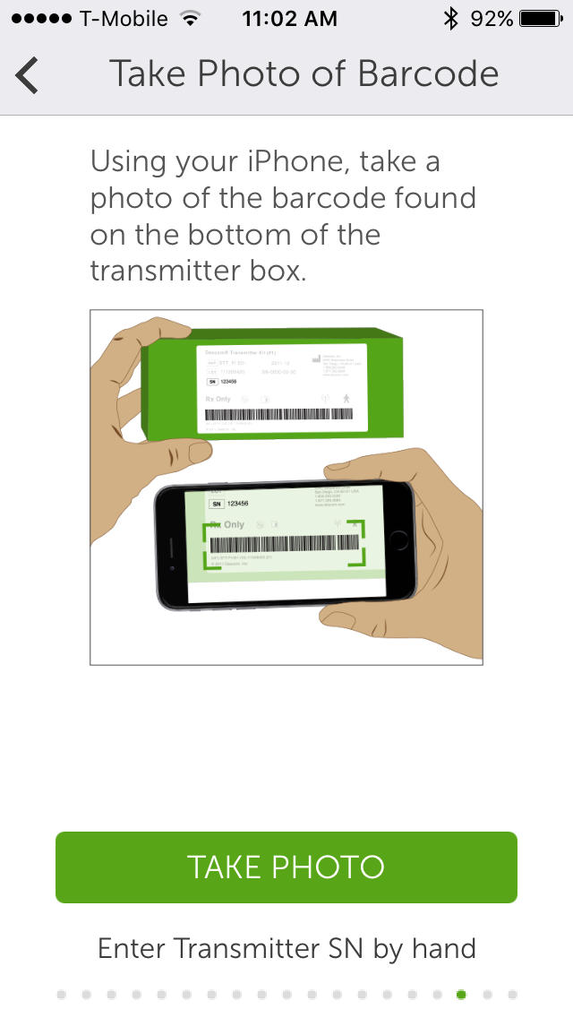
Current Dexcom users will be familiar with the rest. After inserting a sensor and snapping the G5 transmitter in, you simply press “Start Sensor” on the app. G5 still needs a two-hour warm-up, and then it asks for two start-up fingerstick calibrations. You can start a sensor session on either the app or the receiver; the other display will update within a few minutes.
The G5 iPhone App
Highlights
-
Current CGM value shown front-and-center in larger font.
-
Excellent use of color.
-
The clean menu layout includes the essentials and doesn’t bog users down with too many options.
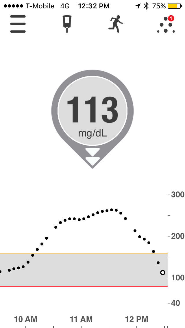
The benefit of the phone over the receiver is immediately apparent after opening the G5 app. A larger screen area shows the CGM value more prominently – if the G4 receiver showed the CGM value in size ~12 font, this is size ~36 font on an iPhone 5. It’s a big improvement, since real-time CGM should prioritize “What’s my current number and trend” above all else.
Color is much better used in the G5 app, and Dexcom has redesigned the way the CGM value and trend arrows appear – a red balloon denotes a low, a yellow balloon denotes a high, and a muted gray means in-range. The arrows wrap around the balloons, a design choice that makes the trend less apparent than with G4 (where the arrow appeared separately to the right of the CGM value; see picture). We like that G5 changes the graph background color dynamically, providing a bolder visual reminder that blood glucose is low or high.
.PNG)
G5 can deplete your phone battery slightly more quickly than if you were not using it at all, so beware if your phone tends to die in the middle of the day. Fortunately, the G5 app will continue giving you real-time data in Airplane Mode and Low Power Mode, both excellent options for extending the iPhone’s battery life.
The G5 app menu structure is simple and there is nothing unnecessary or overwhelming. Besides the main home screen (described above), there are three other main screens: enter a meter calibration, enter “Events,” and Dexcom Share. A few highlights:
-
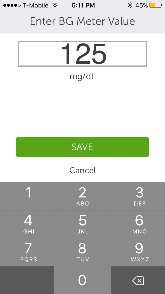
Fingerstick calibrations can now be entered using a keypad, saving time over the previous scroll interface on the receiver.
-
The events screen – allowing manual entry of carb grams, exercise, insulin, and health – demands enough extra steps that it’s hard to use routinely. This could be automated if Dexcom eventually integrates with other apps and devices.
-
G5 preserves remote monitoring with Dexcom Share, allowing parents and caregivers to receive notifications on Apple or Android devices (via Dexcom Follow). G5 users now won’t need to run the Share app.
Interface wise, there is still some wasted white space on the main trend graph screen in the G5 app, though at least you can reduce the top-end to 300 mg/dl. It would be nice if this graph was fully customizable (e.g., you could drag the alert bars to indicate how much space you want the hypoglycemia and hyperglycemia ranges to take up).
There is also no way to view statistics or trends within the G5 app (unlike the FreeStyle Libre reader). You must either open the separate Clarity iPhone app to view a static PDF, or log onto the web-based Clarity software (see below) for full functionality. Both are easy but it is an extra step. According to Dexcom, making the analysis software separate from the G5 app actually made the regulatory process easier (i.e., Clarity is lower risk). That should hopefully result in faster improvements to the software.
G5 Daily App Interaction, Alarms, and Customization
Highlights
-
Alarms are much more customizable and can be louder than receiver.
-
Notifications appear on the lock screen, one swipe and phone unlock to go straight to the G5 app.
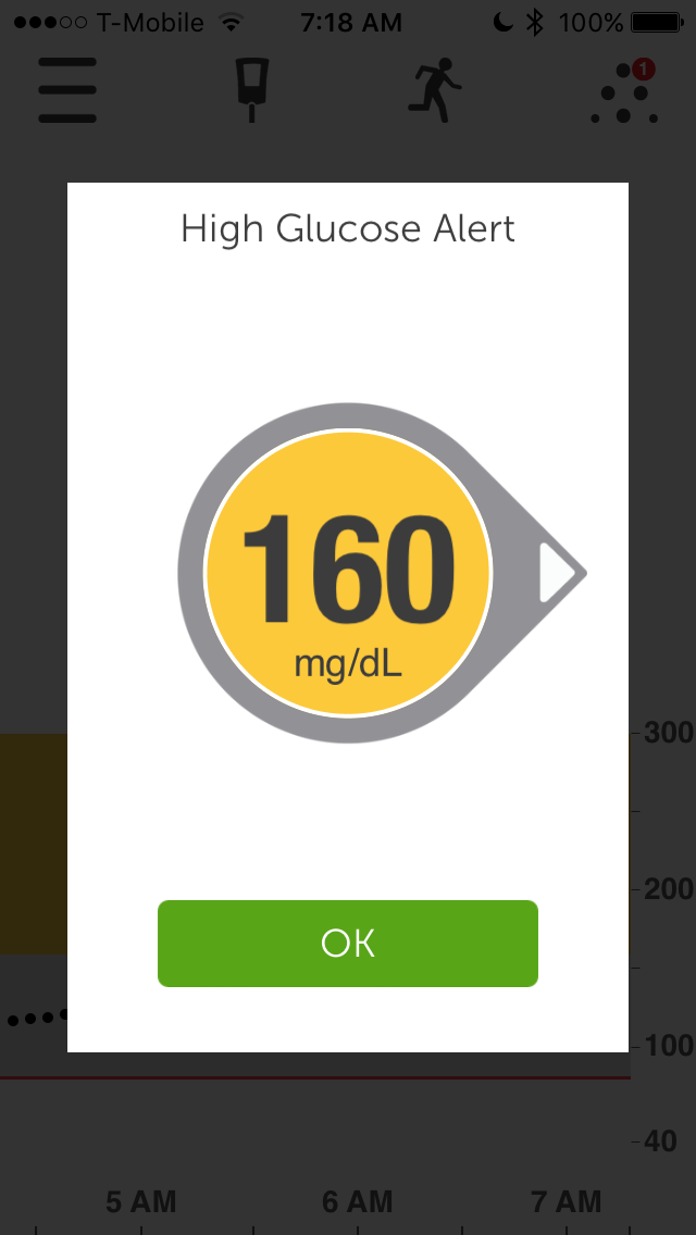
Unlike the receiver - which requires pushing one button to see the current CGM value – the G5 app requires you to unlock your phone and then bring the G5 app on screen. The glanceability could improve with a “Today” widget that enables a single down swipe on the lock screen to see the CGM value and trend graph (e.g., like weather or calendar). We assume Dexcom will eventually release an Apple Watch version of G5 too. Unlocking the phone and pulling up the app only takes a couple seconds, but it does add up, and it is more inconvenient than the receiver.
-
A workaround is to disable your phone’s passcode, but that has its own drawbacks.
-
You can also use Siri and say, “Open G5 app,” though you’ll still have to enter your passcode if you have one. (Hint: Siri hears “Dexcom” as “Decks COM,” so stick with “G5 app”).
.PNG)
Notifications can be accompanied with a sound like on the receiver, assuming:
-
The phone ringer is on and loud enough to hear.
-
The phone is not on vibrate (silent) or “do not disturb.”
Of course, you can also opt for vibration alerts alone.
Like any other iPhone app, the notification settings and sounds are customizable, which has pros and cons. On the plus side, the iPhone can be louder than the receiver alarms, and up to 22 different sounds can be selected for the high and low alerts (including the original G4 receiver sounds). Adam initially selected “Sonar Horn” for his low alert, but when his colleagues jumped out of their chairs and thought it was a fire drill, he opted for the same low alert as on the receiver. Choose your sounds carefully!
Customizing audio preferences does take some fiddling on the iPhone. Adam usually keeps his phone on silent or “do not disturb,” so turning the ringer on was not something he was excited to do. But he still wanted the Dexcom audio alerts, so here was his workaround:
-
Turn ringer on.
-
Go into “Notifications” settings and turn off audio alerts for every app except Dexcom.
-
Go into “Sounds” settings and turn off audio alerts for text messages, calendar, mail, social media, etc. Adam set these to vibrate or off completely.
This is a good way to duplicate the receiver’s audio functions, but to minimize the cacophony from other random phone notifications. Obviously, G5 app notifications can be turned off or set to vibrate at any time.
It can be easier to wake up to alarms at night with G5, since the iPhone sounds are much louder and more varied than on the receiver. G5 will work on airplane mode (though Share won’t work), offering a good nighttime option to minimize notifications and keep the phone in the same room.
G5 Transmitter
Highlights
-
The transmitter pairs with two devices (phone and receiver), which can be used independently, together, and seamlessly swapped.
.jpg) The transmitter is really the hub of G5: it broadcasts the sensor signal via Bluetooth and allows both the phone and receiver to independently pick it up. You can enter a fingerstick calibration on the phone or app, and the other device will update automatically within a few minutes.
The transmitter is really the hub of G5: it broadcasts the sensor signal via Bluetooth and allows both the phone and receiver to independently pick it up. You can enter a fingerstick calibration on the phone or app, and the other device will update automatically within a few minutes.
Fortunately, you don’t have to tell the phone or receiver which one you are going to use at any given time. The transmitter sends out a new signal every five minutes, meaning each device will independently pick the signal up if it is in range. This allows switching between displays effortlessly.
On the downside, the G5 transmitter range seems shorter than on the G4. While G4 had a 20+ foot range in our experience, we got more of a 5-10 foot range with G5. G5 cannot transmit through multiple floors of a house, while G4 generally could. The G5 phone app drops the signal more often than the receiver, but it doesn’t happen overwhelmingly often. And usually it is just one or two data points.
The G5 transmitter is the same size as the original G4 Platinum transmitter. That is smaller than we would have guessed, given the addition of Bluetooth and the ability to pair with two devices. A downside to the new transmitter is a battery life of three months, down from six months for the G4 Platinum. The G4 transmitter generally lasted longer than six months, so perhaps G5 will too.
We’d note that the transmitter sends data in real-time and does not save any glucose history. In other words, it cannot backfill missing data when both displays are out of range. For example, if you leave both the receiver and phone at home and go for a run, the data is completely lost. This is an issue for those limited cases when you don’t have either the phone or receiver in-range, but really want to gather the glucose data during that time (exercise is the obvious one)
G5 Receiver
Highlights
-
White background screen is easier to read.
-
Better use of color and notifications actually show the current glucose value and trend arrow instead of a generic low or high alert.
(1).jpg) For those familiar with the G4 receiver, the new G5 receiver won’t feel much different. Dexcom has primarily made some user interface tweaks: (i) the background screen is now white, making it much easier to read (ii) the receiver shows colored banners across the top to indicate a low or high (instead of a colored number on a black background); (iii) high or low pop-up notifications actually show the current glucose value and trend (LOW – 77 mg/dl > ) instead of just a generic message (LOW).
For those familiar with the G4 receiver, the new G5 receiver won’t feel much different. Dexcom has primarily made some user interface tweaks: (i) the background screen is now white, making it much easier to read (ii) the receiver shows colored banners across the top to indicate a low or high (instead of a colored number on a black background); (iii) high or low pop-up notifications actually show the current glucose value and trend (LOW – 77 mg/dl > ) instead of just a generic message (LOW).
.JPG)
Like the G5 app, there is still a lot of wasted white space on the main trend graph screen, and you cannot get statistics or pattern recognition on the receiver itself. On a positive note, Dexcom Clarity automatically detects a plugged in receiver (via a Mac or PC software tool), so uploading data and viewing stats takes less than one minute on a computer.
Those using the G4 Receiver with Share can update the software to make their current receiver talk to the G5 transmitter.
Sensor Accuracy and Calibration
Highlights
-
Retains the excellent G4 Platinum accuracy and reliability – an average 9% error versus laboratory blood glucose values.
G5 uses the same G4 Platinum sensor and includes the updated Software 505 algorithm. This gives G5 an average 9% error vs. laboratory blood glucose values – for context, if your blood sugar is 100 mg/dl on average, that means G5 will be off from your real blood glucose value by ~9 mg/dl on average. This is the best accuracy of any CGM available (on average), though everyone experiences different results. Dexcom believes this accuracy approaches glucose meters; we would agree in our experience.
Like G4, G5 asks for two calibrations per day. The most important calibrations are the first few. It’s crucial to wash hands and actually take two individual fingersticks at start-up – meters are less accurate than we all believe!
G5 is still not approved for dosing insulin in the US (it is in Europe), but many patients do this in the real world as they gain trust. Adam has built enough confidence in G4 and G5 that he often only tests two times per day (once in the morning and once at night). He tests more often on day one of a sensor (when accuracy is the worst), if he doesn’t believe the CGM value, or if he is about to take a large correction dose of insulin.
Dexcom Clarity (web-based analysis software)
Highlights
-
Outstanding pattern recognition, critical statistics, and colorful graphs to identify problem times.
-
Makes CGM data more approachable, but allows for customization in the right places.
-
Data running through G5 app posts automatically to Clarity; the uploader is PC and Mac compatible and automatically detects receiver.
-
“Best Glucose Day” report.
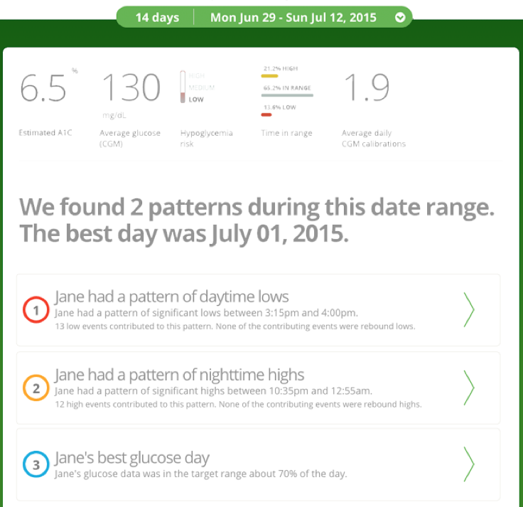 Adam is addicted to Dexcom Clarity, the new web-based analysis software (free) that launched with G5 and also works with the G4 receiver. If you’re running the G5 app, CGM automatically posts to Clarity with a four-hour delay. Otherwise, you can download the PC and Mac compatible uploader, which sits in the background on your computer, auto-detects the receiver within seconds, and uploads the data in ~20 seconds.
The web version of Clarity revolves around just four screens and is focused on identifying problem areas (When am I going low or high?) and keeping things approachable. Every screen allows for customizing the date range, though it defaults to two weeks and can’t display more than 30 days of data at a time.
The “Overview” screen is a terrific one-page snapshot of key information – within 60 seconds you can answer, “Where am I having trouble?” This page shows an estimated A1c, average blood glucose, hypoglycemia risk (low, medium, high), time-in-range, calibrations per day, and any identified patterns.
“Patterns” gives a deeper dive on the times of day when glucose was consistently above or below target, and Clarity shows the days of CGM traces that make up a particular pattern. The software also identifies your “best glucose day,” a nice focus on the underappreciated positive side of diabetes. This screen also gives “possible considerations” based on the pattern, but they are too generic to be actionable.
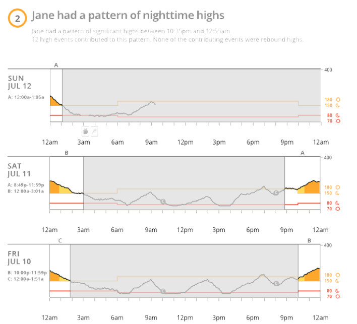 The “Data” page shows a single CGM graph with error bars to indicate times of day with lots of variability. The use of color and the error bars makes it clear what times of day are a problem. You can also thumb through daily CGM traces, and Clarity will add “event” markers entered into G5, such as logged grams of carbs, exercise, and insulin doses. It’s currently not easy enough for Adam to regularly add events, but maybe future app integrations will improve this experience.
“Compare” shows two periods of time side-by-side each other. This is useful to see the impact a particular change has had on your diabetes – e.g., eating lower carb for a week, exercising more often over two weeks.
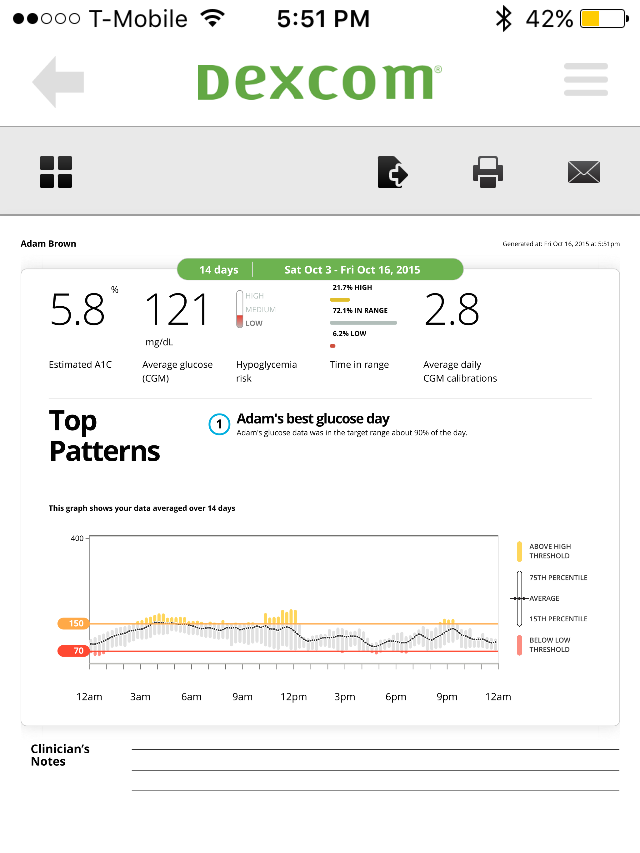 Dexcom does have a Clarity iPhone app, though it only allows viewing a PDF of the past two weeks of data, which will be absent unless you’ve uploaded the receiver or are using the G5 app. It would be nice if more Clarity functionality was available in the iPhone app, though it is not a tremendous hassle to open the website. The Clarity app seems ideal as an on-the-go option for appointments with a provider.
Apple Health
The G5 app automatically posts data to Apple Health, allowing other diabetes apps like Glooko, Meal Memory, and One Drop to access it (probably mySugr too in the future). This is the idea of a diabetes “ecosystem of apps” targeted to specific needs and patient preferences. Imagine apps for meals, for exercise, for deeper CGM analysis, for social networking, or anything else. That is the promise of Apple Health.
The one downside is G5 posts data to Apple Health with a three-hour delay, meaning other apps cannot offer real-time benefits. This delay stems from how the FDA defines historical (“retrospective”) data; perhaps it will decrease in the future.
What Does it Cost?
The best answer is to talk to Dexcom, since insurance varies by company and plan. Most US private insurance companies (e.g., United, Aetna, Humana, Anthem, Cigna) cover CGM, though requirements, co-insurance, and deductibles vary widely. Medicare does not cover personal CGM, but this will hopefully change. Many European countries are now paying for CGM, but again, it varies across the board.
If you don’t have insurance, CGM is expensive, probably running a few thousand dollars per year.
The G5 pricing model is similar to G4: an upfront price to get the starter kit, which includes the receiver, a transmitter, and four sensors. The G5 app is free. Ongoing costs include transmitters (up to four per year, though might be less in practice) and seven-day sensors. Dexcom has not disclosed what each component costs.
We hope CGM gets less expensive over time, particularly if more patients can pay a pharmacy co-pay for sensors (similar to picking up a drug).
Our G5 Wishlist
App
-
Make it easier and faster to see real-time CGM values and trends on the phone: (i) add a Today widget; (ii) add smart watch compatibility; (iii) show actual CGM values and trends on the lock screen notifications.
-
Android compatibility (reportedly coming in 2016).
-
Add statistics within the G5 app, or build out the Clarity iPhone app with more functionality.
-
Enable users to take a picture of a meal instead of just manually logging the carbs in Events.
-
Improve Events logging by integrating with other apps and devices (Fitbit, Strava, LoseIt!, myfitnesspal).
-
Allow customization of the trend graph to prevent wasted white space. Can the scale be modified to devote larger areas of the screen to hypoglycemia and in-range?
-
Reduce the three-hour time-delay to post data to Apple Health (this is an FDA issue).
-
Add an insulin-dosing calculator that uses the CGM value, trend arrow, and planned carb intake.
Transmitter
-
Improve the signal reliability between the transmitter and the G5 phone app.
-
Increase signal range.
-
Reduce transmitter size and extend the battery life beyond three months.
-
Enable some data back-filling – could the transmitter store the last 30 minutes of data?
System
-
Make it less expensive.
-
Obtain FDA approval to dose insulin without a confirmatory fingerstick (the G5 already has this approval in Europe).
-
Factory calibration (no fingersticks).
Dexcom told us it is actively working on these improvements, or is considering them for future products – most are not simple or they would have been done already!
What Is Next for Dexcom?
-
Android G5 – 2016
-
FDA approval for insulin dosing off CGM – 2016
-
G5 pump integrations (Tandem, Insulet, Animas, and Bigfoot Biomedical) – late 2016 at the very earliest
-
G6 – 2017 (one calibration per day, with fewer expected over time)
-
Smaller transmitters and a new receiver – In development
-
Google/Dexcom disposable sensor – 2017-2018+
Concluding Thoughts
We’re excited that the G5 has arrived – earlier than expected – and we’re obvious fans, unsurprising since we both started wearing CGM many years ago. It’s great to see how fast Dexcom is moving, a company with ambitious goals and strong leadership. We can’t wait to see what’s next!

